


Achtli a typeface for first readers
This project began in 2019 when we made a field study about the typefaces used in educational books for learning to read, created by the Ministry of Education in Mexico. These books are supposed to be suitable for children between 5 and 7 years old. From this research, we realized some premises and details that would help facilitate children’s learning in the process of reading.
From there, we have designed a typeface with the purpose to enhance the reading learning experience during our residence at Hoffmitz Milken Center for Typography in February 2021.


We hypothesize that the recognition of characters is a determining factor in the design of fonts for first readers. We know that a typographic font is a system in which the similarity and standardization of its elements is the key to success is recognizing the basic shapes of the alphabet but we proposed to include certain differentiating features in a controlled way, that can help the reader to better recognize the characters, at first sight.


Manual and digital sketches and first ideas
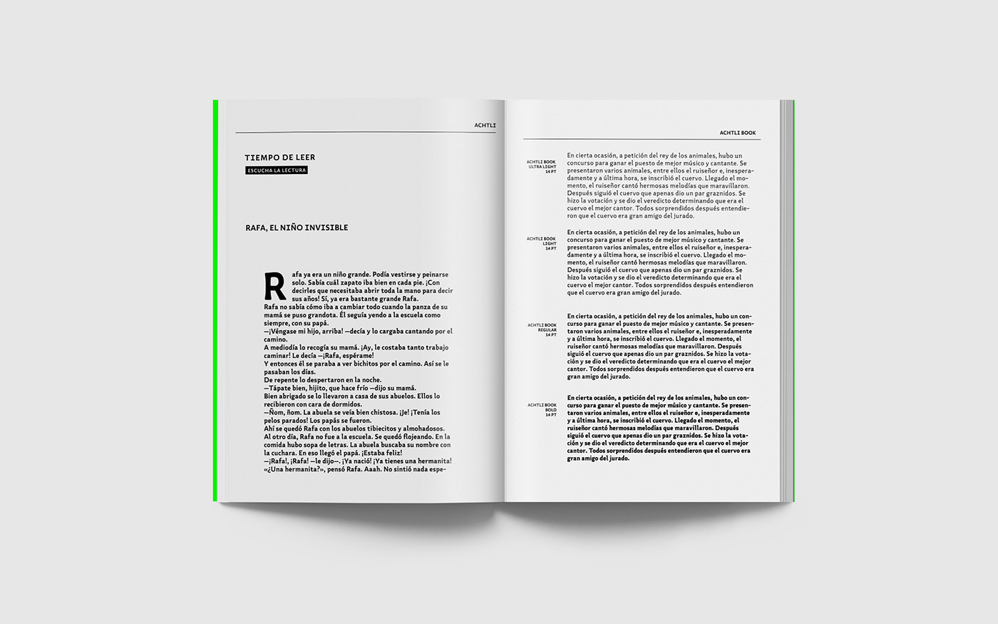
That is how Achtli is born, its forms have a moderate contrast and semi-serif endings that allow a clear identification of the characters, slightly flared stems to emphasize the weight on the finishes, moving away from the homogeneity of the geometric fonts used in this kind of books.
We also proposed warm and modern shapes, with fractured and rounded ends that allow the font a strong but close personality, generating empathy with the reading public.


ACHTLI BOOK
Detached from the need to connect typography with other knowledge fields involved with the learning to read process like pedagogy and publishers we have extended the project to develop first, a complete typeface family with an extended character set ideal to design print and digital publications for first readers.


ACHTLI DIDACTIC
The second extension of the project leads to a font that is at the same time a didactic material. Achtli didactic is an easy-to-use game and an easy-to-play typeface, created to help first readers to read, write and make fun reading, recognition, and memorization during that learning process.
Additionally, the icons created for Achtli Didactic can function outside of the game as supporting vignettes for editorial use. As these illustrations carry out the same typeface DNA in terms of look and weight, it may be a resource for the professor or the designer to create new things. That is why we have included them in the other two versions, Achtli and Achtli Book as part of the character set. The user can access them via the character panel, instructions are explained in the user manual.


Icons sketches


